A
Auto Express
Guest
In July this year, the Department for Transport opened a call for evidence into roads policing. Nestling in this official announcement was a consideration of whether “advances in car infotainment systems” were linked to a “plateauing” of road death and injury statistics, which have not fallen significantly since 2010.
Similarly, Auto Express frequently receives letters and E-mails such as the one opposite from readers voicing concerns that infotainment touchscreens have either become too complicated, replace too many buttons, are positioned badly, or are awkward to operate.
To help shed some light on the issue and find out what mistakes have been made in the past, what makes a good system, and what the future may hold, we spoke to three experts in the field of in-car infotainment.
The newest touchscreens tend to benefit from modern computing power, which means lag – the time taken from a screen being tapped and the system responding – is almost a thing of the past. Older cars’ systems and legacy units that are still fitted to new cars can be too slow to respond, though.
“If you press the screen and it doesn’t respond because of static, or there’s a lag, that’s a problem” Euro NCAP board member Matthew Avery says, adding: “You end up doing the same action two or three times, or you look at your first action, wondering if it occurred. All of that takes your eyes off the road.”
image
image
image
image
image
image
image
image
image
image
image
image
image
image
image
image
image
image
image
image
image
image
image
image
image
image
image
image
image
That concern is echoed by Darren Wilson, who has worked with Jaguar Land Rover on its infotainment systems and now runs his own firm, UXcentric. “Maybe certain brands did try to do too much at a certain point,” Wilson says. “Look around and you’ll find feedback from customers saying: ‘This thing is too sluggish; when you press it, it takes too long to react’.” However Wilson adds that he considers this issue generally only applies to older systems as cars age.
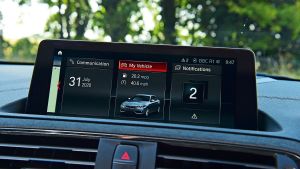
Infotainment screens used to be more of an add-on item, originally being reserved for audio, navigation and trip-computer functions. Today’s systems are often integral to the car, responsible for everything from suspension settings to lighting, climate and safety systems.
This tends to make modern screens less of an afterthought. “A good overall system is part of the whole car development,” BMW’s Claus Dorrer explains, adding: “UI [user interface] and UX [user experience] are part of the first steps of building a new car.”
Dorrer adds that infotainment systems must offer “interruptibility”, meaning they will wait, holding a menu open in place if the driver has to pause midway through an operation. “Interruptibility is a very important part in designing a system,” he explains. “It’s important, when you open a menu, for example, we hold it open so the driver can concentrate on maybe a critical crossing situation, and then continue on at the same point...The car is waiting for input.”
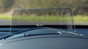
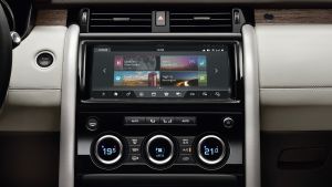
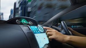
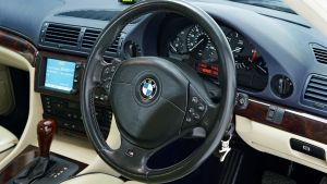
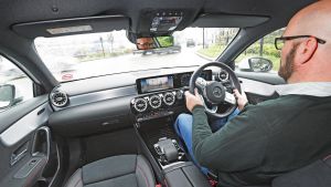
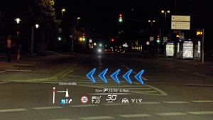
As well as becoming more integral to the functioning of cars, the positioning of touchscreens has also changed over the years. Early screens tended to sit low down in a car’s dashboard, away from the driver’s line of sight. Newer units usually feature higher up on the dash, meaning the driver has to move their eyes away from the road less when checking navigation guidance, for example. It’s something that head-up displays improve further. “Our main purpose when designing a UI system is making sure our drivers can keep their eyes on the road; and the whole development and layout are designed for that,” Dorrer says.
That’s a point of view Avery also holds: “Ultimately you want people to have hands on the wheel and eyes on the road for the majority of the time.”

image

image

image

image

image

image

image

image

image

image

image

image

image

image

image

image

image

image

image

image

image

image

image

image

image

image

image

image

image
Dorrer continues, “What’s really important for us when designing a UX is that it should always be a system used when driving. The main focus for the driver is to have their eyes on the road, and to concentrate on driving, having hands on the wheel.”
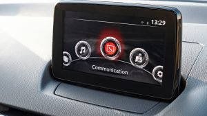
Different firms have different sets of rules when developing infotainment screens, but Wilson highlights that menu design is of crucial importance. “Within the automotive world, it’s about making sure content that is used frequently is high up, so it doesn’t require several steps to get to.” Wilson also says a great deal of attention is paid to icon design and clarity, as well as ensuring colours don’t “wash out” in bright sunlight. These considerations, in addition to ensuring the “logical grouping of related content so that screens are intuitive”, help create systems that are easy to use.
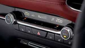
A frequent complaint we hear from readers is that some controls shouldn’t be relegated to touchscreens and should remain as physical switches. Dorrer says keeping physical heating controls is “definitely” a conscious decision within BMW, although he adds: “We also see with an increasing number of intelligent functions that some of the functionalities which used to be placed with hard buttons might not be necessary in the future, because the system is intelligent enough, or offers an easy way of interacting at the right moment.”
“I completely get that people want hard switches for certain controls,” Wilson says, adding: “You can use them blindly because you’ve got a general idea about where that key is, and you can feel around for it without taking your eyes off the road.”
Like many topics in infotainment design, however, there is a flip side, Wilson explains: “That’s not to say that stuff that’s gone into a screen isn’t safe to use, and we have to go through very diligent design processes in terms of reviews, testing under very stringent guidelines that things are very easy to operate when stationary and on the move.”
Avery echoes this, explaining that if cars have too many buttons, dials and switches, “unless you can memorise the buttons, you’ve got just as much distraction, as you’re looking around for which button to press.”
He adds: “I’ve seen touchscreens that are very clear, with big graphics and good responsiveness. And that’s fine. But if you are taking too many things into that touchscreen and making it very complicated, that’s as big a distraction... This isn’t an issue about touchscreens per se versus separate buttons, it’s about having so many controls on the vehicle now. What you need is to go straight to the action and it to work immediately, and involve very little eyes-off time.”
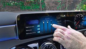
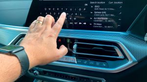
“If you have to reach a touchscreen by getting away from your comfortable and safe driving position, it’s not a good solution”, Dorrer tells us, explaining this is partly the reason why BMW offers “multimodality” in its input methods, with touchscreen tapping, steering-wheel buttons, the iDrive rotary selector, gesture control and voice activation
among the options offered to drivers. “What we also see is that complex interaction topics, like starting the navigation to a new destination, is done by speech, for example, and that’s why the modalities of interacting with a car will expand. Our philosophy is also the power of choice for our drivers, using their easiest way to interact.”
Wilson considers multimodality as “powerful in one way, but in another, there are too many ways to do the same thing. If you provide one way, and it’s easy, you know how to do it.”

image

image

image

image

image

image

image

image

image

image

image

image

image

image

image

image

image

image

image

image

image

image

image

image

image

image

image

image

image
Avery, meanwhile, adds that having somewhere to rest your wrist when using a touchscreen can also be beneficial. “Hand support is also quite important, because you’ve got the car moving around... if you aim at the wrong place because the car is jiggling around and your arm is not supported, all of that leads to doing the same action two or three times.”
Wilson considers that some infotainment systems are “getting really complex in terms of what they offer. Whether people use everything? Probably not. There are systems on there that people will never use, I’m absolutely sure.”
As a counterpoint to that, however, customer demand plays a part in touchscreen development, with many drivers expecting their cars to feature increasing amounts of tech. Yet the inverse can also be true, because Wilson tells us that his own parents bought the previous generation of a popular family hatch rather than the new one because: “They were put off by how much touch interaction was in there; not just with the screen, but the amount of capacitive switches.”
All drivers know what a hazard-warning-light switch looks like, while the symbol for a heated rear windscreen is also universally recognised. Should touchscreens be similarly standardised to promote familiarity and save thinking time?
This was something that Euro NCAP explored “about five years ago”, Avery says, explaining: “We had more challenges over this from vehicle manufacturers than probably anything we’ve ever had before. The key issue is we were [seen as] being design-restrictive.” Avery relates that manufacturers argued they work with their customer bases, who buy cars from a company often at least in part because of the way the individual firm does things.
“From a logical point of view, all cars would have their controls laid out the same way,” Avery adds. “We were saying that we believe, for safety, there should be more consistency in the way these things are done. The manufacturers have said ‘not necessarily, we want to make the brand experience unique, which means it’s got to be different’. We never got much further than that, but it’s an aspiration. That would be the safest thing to do.”
Avery does think standardisation is starting to happen, though, partly thanks to the growing use of smartphones as part of the infotainment experience: “We’ve seen it with Apple CarPlay – it’s always the same, and that consistency is a real boon for safety, because people expect things to happen in the same way in every car.”

image

image

image

image

image

image

image

image

image

image

image

image

image

image

image

image

image

image

image

image

image

image

image

image

image

image

image

image

image
Having worked directly on developing automotive touchscreens, Wilson is well placed to understand how approaches to standardisation work: “I get what the OEMs [original equipment manufacturers] are saying about wanting to protect their own brand experience, but I still think there are elements that could be refined so that they work the same in every car.”
However, Avery is cautious about placing too much emphasis on the effect that touchscreens play on road safety, explaining: “Since the proliferation of touchscreens from around 2012, there has been an increase in distraction crashes, statistically. Not very much, a two per cent increase from around 2014 to 2018 [in what are] regarded as distraction crashes. The stats won’t tell you if that’s a touchscreen, cellphone, or impairment, though. We don’t think impairment is going up, but we do think phone use is going up.”
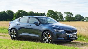
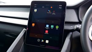
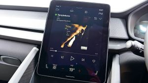
“I’m not sure that the perfect system is out there,” Avery says. “What you tend to find is some people do some things well, and others, not so well.” He does consider, however, that voice control has a big role to play in the future, highlighting Google’s Android Automotive system in the Polestar 2 as being particularly effective. This set-up is able to recognise natural language, while controlling everything, from music and navigation settings to climate control, via spoken inputs.
Wilson, meanwhile, has a number of principles when working on automotive touchscreens. These include reducing the number of steps used “for high-frequency controls”, developing menus and systems consistently “to reduce learning” for drivers coming to a new set-up, and locking out menu content that is “deemed too complex to operate when on the move”.
Dorrer says that BMW’s golden rule for developing its systems is: “Change it only if there is proof that it’s better than before. That’s our biggest golden rule in designing UI systems. Sometimes that’s also a big internal discussion: what our criteria are to make sure it’s better, but at that point we really listen to the customer studies, the customer voice.”
The are many factors that make a great infotainment system. Drivers almost always use these systems on the move, so screen placement is key, as is the resolution of the graphics, in order to ensure that you don’t have to take your focus off the road for too long (looking down is a big no-no).
Speed of response is a big factor as well – if you’re forever having to jab at a screen or click a control wheel, it yet again diverts attention away from the road. Apart from anything else, making repeated inputs is incredibly frustrating.
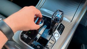
This is why control method is also important. The best touchscreen systems are intuitive and sometimes offer haptic feedback so you know your input has been registered. However, control interfaces such as BMW’s scroll wheel let you ‘feel’ your way around the system using the wheel’s detents and clicks so you know where you are in the menus. Sometimes you don’t even have to look away from the road.
Features make a big difference, too. We want plenty of tech (CarPlay and Android Auto are a must these days) that is simple to use and makes life easier – but menu layout is just as important, because these features have to be easy to access.
What makes a great infotainment system is a combination of things, but the best units have many of these points in common, while the worst all do the bad things badly. We’ve listed our favourite multimedia set-ups below, as well as the ones to avoid.
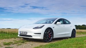
Tesla

image

image

image

image

image

image

image

image

image

image

image

image

image

image

image

image

image

image

image

image

image

image

image

image

image

image

image

image

image
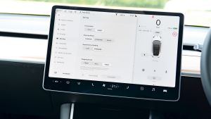
The expansive and responsive touchscreens in the Model 3, S and X offer great resolution, which makes the display a one-stop shop for all of the car’s controls. There are lots of features – even arcade games!
BMW

image

image

image

image

image

image

image

image

image

image

image

image

image

image

image

image

image

image

image

image

image

image

image

image

image

image

image

image

image
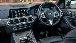
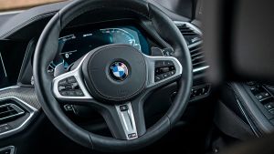
Latest OS 7.0 iDrive has an easy control wheel, great graphics and lots of tech, so it’s great to use. BMW was an early adopter of infotainment, and it has refined its offerings over the decades.
Polestar Google Assistant

image

image

image

image

image

image

image

image

image

image

image

image

image

image

image

image

image

image

image

image

image

image

image

image

image

image

image

image

image
It’s not compatible with Apple CarPlay, but sat-nav, voice control and apps such as Spotify mean this is the future of infotainment for manufacturers that don’t want the expense of developing a system themselves.
Lexus

image

image

image

image

image

image

image

image

image

image

image

image

image

image

image

image

image

image

image

image

image

image

image

image

image

image

image

image

image
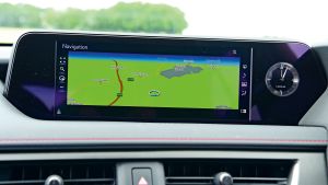
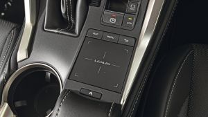
The frustrating touchpad jumps from option to option, with seemingly a mind of its own, requiring more attention than it should. The graphics are poor, too, but at least the latest smartphone connectivity is now offered.
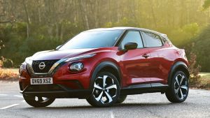
Nissan Connect

image

image

image

image

image

image

image

image

image

image

image

image

image

image

image

image

image

image

image

image

image

image

image

image

image

image

image

image

image
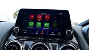
Once upon a time, the infotainment in Nissan’s then-class-leading SUVs was fine, but the firm seems to have rested on its laurels and, with no big updates, it’s languishing compared with rival interfaces.
Fiat U Connect

image

image

image

image

image

image

image

image

image

image

image

image

image

image

image

image

image

image

image

image

image

image

image

image

image

image

image

image

image
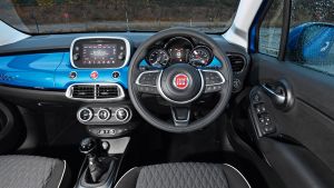
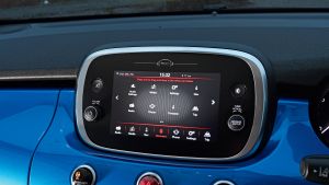
Even top-spec models feature small display screens, while the graphics are grainy and the units lack features. The tech is in need of a major overhaul when small-car rivals are excelling.
Check out some of the most exciting car technology coming in the near future here...
Continue reading...
Similarly, Auto Express frequently receives letters and E-mails such as the one opposite from readers voicing concerns that infotainment touchscreens have either become too complicated, replace too many buttons, are positioned badly, or are awkward to operate.
- SEE MORE Safest cars for sale in the UK 2020
To help shed some light on the issue and find out what mistakes have been made in the past, what makes a good system, and what the future may hold, we spoke to three experts in the field of in-car infotainment.
Slow systems
The newest touchscreens tend to benefit from modern computing power, which means lag – the time taken from a screen being tapped and the system responding – is almost a thing of the past. Older cars’ systems and legacy units that are still fitted to new cars can be too slow to respond, though.
“If you press the screen and it doesn’t respond because of static, or there’s a lag, that’s a problem” Euro NCAP board member Matthew Avery says, adding: “You end up doing the same action two or three times, or you look at your first action, wondering if it occurred. All of that takes your eyes off the road.”

image

image

image

image

image

image

image

image

image

image

image

image

image

image

image

image

image

image

image

image

image

image

image

image

image

image

image

image

image
That concern is echoed by Darren Wilson, who has worked with Jaguar Land Rover on its infotainment systems and now runs his own firm, UXcentric. “Maybe certain brands did try to do too much at a certain point,” Wilson says. “Look around and you’ll find feedback from customers saying: ‘This thing is too sluggish; when you press it, it takes too long to react’.” However Wilson adds that he considers this issue generally only applies to older systems as cars age.
Poorly integrated screens
Infotainment screens used to be more of an add-on item, originally being reserved for audio, navigation and trip-computer functions. Today’s systems are often integral to the car, responsible for everything from suspension settings to lighting, climate and safety systems.
This tends to make modern screens less of an afterthought. “A good overall system is part of the whole car development,” BMW’s Claus Dorrer explains, adding: “UI [user interface] and UX [user experience] are part of the first steps of building a new car.”
Dorrer adds that infotainment systems must offer “interruptibility”, meaning they will wait, holding a menu open in place if the driver has to pause midway through an operation. “Interruptibility is a very important part in designing a system,” he explains. “It’s important, when you open a menu, for example, we hold it open so the driver can concentrate on maybe a critical crossing situation, and then continue on at the same point...The car is waiting for input.”
Eyes off the road
As well as becoming more integral to the functioning of cars, the positioning of touchscreens has also changed over the years. Early screens tended to sit low down in a car’s dashboard, away from the driver’s line of sight. Newer units usually feature higher up on the dash, meaning the driver has to move their eyes away from the road less when checking navigation guidance, for example. It’s something that head-up displays improve further. “Our main purpose when designing a UI system is making sure our drivers can keep their eyes on the road; and the whole development and layout are designed for that,” Dorrer says.
That’s a point of view Avery also holds: “Ultimately you want people to have hands on the wheel and eyes on the road for the majority of the time.”

image

image

image

image

image

image

image

image

image

image

image

image

image

image

image

image

image

image

image

image

image

image

image

image

image

image

image

image

image
Dorrer continues, “What’s really important for us when designing a UX is that it should always be a system used when driving. The main focus for the driver is to have their eyes on the road, and to concentrate on driving, having hands on the wheel.”
Menu and graphic design
Different firms have different sets of rules when developing infotainment screens, but Wilson highlights that menu design is of crucial importance. “Within the automotive world, it’s about making sure content that is used frequently is high up, so it doesn’t require several steps to get to.” Wilson also says a great deal of attention is paid to icon design and clarity, as well as ensuring colours don’t “wash out” in bright sunlight. These considerations, in addition to ensuring the “logical grouping of related content so that screens are intuitive”, help create systems that are easy to use.
Disappearing physical controls
A frequent complaint we hear from readers is that some controls shouldn’t be relegated to touchscreens and should remain as physical switches. Dorrer says keeping physical heating controls is “definitely” a conscious decision within BMW, although he adds: “We also see with an increasing number of intelligent functions that some of the functionalities which used to be placed with hard buttons might not be necessary in the future, because the system is intelligent enough, or offers an easy way of interacting at the right moment.”
“I completely get that people want hard switches for certain controls,” Wilson says, adding: “You can use them blindly because you’ve got a general idea about where that key is, and you can feel around for it without taking your eyes off the road.”
- SEE MORE Best cars for infotainment
Like many topics in infotainment design, however, there is a flip side, Wilson explains: “That’s not to say that stuff that’s gone into a screen isn’t safe to use, and we have to go through very diligent design processes in terms of reviews, testing under very stringent guidelines that things are very easy to operate when stationary and on the move.”
Avery echoes this, explaining that if cars have too many buttons, dials and switches, “unless you can memorise the buttons, you’ve got just as much distraction, as you’re looking around for which button to press.”
He adds: “I’ve seen touchscreens that are very clear, with big graphics and good responsiveness. And that’s fine. But if you are taking too many things into that touchscreen and making it very complicated, that’s as big a distraction... This isn’t an issue about touchscreens per se versus separate buttons, it’s about having so many controls on the vehicle now. What you need is to go straight to the action and it to work immediately, and involve very little eyes-off time.”
Input choices and ergonomics
“If you have to reach a touchscreen by getting away from your comfortable and safe driving position, it’s not a good solution”, Dorrer tells us, explaining this is partly the reason why BMW offers “multimodality” in its input methods, with touchscreen tapping, steering-wheel buttons, the iDrive rotary selector, gesture control and voice activation
among the options offered to drivers. “What we also see is that complex interaction topics, like starting the navigation to a new destination, is done by speech, for example, and that’s why the modalities of interacting with a car will expand. Our philosophy is also the power of choice for our drivers, using their easiest way to interact.”
Wilson considers multimodality as “powerful in one way, but in another, there are too many ways to do the same thing. If you provide one way, and it’s easy, you know how to do it.”

image

image

image

image

image

image

image

image

image

image

image

image

image

image

image

image

image

image

image

image

image

image

image

image

image

image

image

image

image
Avery, meanwhile, adds that having somewhere to rest your wrist when using a touchscreen can also be beneficial. “Hand support is also quite important, because you’ve got the car moving around... if you aim at the wrong place because the car is jiggling around and your arm is not supported, all of that leads to doing the same action two or three times.”
Complex systems
Wilson considers that some infotainment systems are “getting really complex in terms of what they offer. Whether people use everything? Probably not. There are systems on there that people will never use, I’m absolutely sure.”
As a counterpoint to that, however, customer demand plays a part in touchscreen development, with many drivers expecting their cars to feature increasing amounts of tech. Yet the inverse can also be true, because Wilson tells us that his own parents bought the previous generation of a popular family hatch rather than the new one because: “They were put off by how much touch interaction was in there; not just with the screen, but the amount of capacitive switches.”
Lack of standardisation
All drivers know what a hazard-warning-light switch looks like, while the symbol for a heated rear windscreen is also universally recognised. Should touchscreens be similarly standardised to promote familiarity and save thinking time?
This was something that Euro NCAP explored “about five years ago”, Avery says, explaining: “We had more challenges over this from vehicle manufacturers than probably anything we’ve ever had before. The key issue is we were [seen as] being design-restrictive.” Avery relates that manufacturers argued they work with their customer bases, who buy cars from a company often at least in part because of the way the individual firm does things.
“From a logical point of view, all cars would have their controls laid out the same way,” Avery adds. “We were saying that we believe, for safety, there should be more consistency in the way these things are done. The manufacturers have said ‘not necessarily, we want to make the brand experience unique, which means it’s got to be different’. We never got much further than that, but it’s an aspiration. That would be the safest thing to do.”
Avery does think standardisation is starting to happen, though, partly thanks to the growing use of smartphones as part of the infotainment experience: “We’ve seen it with Apple CarPlay – it’s always the same, and that consistency is a real boon for safety, because people expect things to happen in the same way in every car.”

image

image

image

image

image

image

image

image

image

image

image

image

image

image

image

image

image

image

image

image

image

image

image

image

image

image

image

image

image
Having worked directly on developing automotive touchscreens, Wilson is well placed to understand how approaches to standardisation work: “I get what the OEMs [original equipment manufacturers] are saying about wanting to protect their own brand experience, but I still think there are elements that could be refined so that they work the same in every car.”
However, Avery is cautious about placing too much emphasis on the effect that touchscreens play on road safety, explaining: “Since the proliferation of touchscreens from around 2012, there has been an increase in distraction crashes, statistically. Not very much, a two per cent increase from around 2014 to 2018 [in what are] regarded as distraction crashes. The stats won’t tell you if that’s a touchscreen, cellphone, or impairment, though. We don’t think impairment is going up, but we do think phone use is going up.”
The touchscreen of the future
“I’m not sure that the perfect system is out there,” Avery says. “What you tend to find is some people do some things well, and others, not so well.” He does consider, however, that voice control has a big role to play in the future, highlighting Google’s Android Automotive system in the Polestar 2 as being particularly effective. This set-up is able to recognise natural language, while controlling everything, from music and navigation settings to climate control, via spoken inputs.
Wilson, meanwhile, has a number of principles when working on automotive touchscreens. These include reducing the number of steps used “for high-frequency controls”, developing menus and systems consistently “to reduce learning” for drivers coming to a new set-up, and locking out menu content that is “deemed too complex to operate when on the move”.
Dorrer says that BMW’s golden rule for developing its systems is: “Change it only if there is proof that it’s better than before. That’s our biggest golden rule in designing UI systems. Sometimes that’s also a big internal discussion: what our criteria are to make sure it’s better, but at that point we really listen to the customer studies, the customer voice.”
The good and the bad
The are many factors that make a great infotainment system. Drivers almost always use these systems on the move, so screen placement is key, as is the resolution of the graphics, in order to ensure that you don’t have to take your focus off the road for too long (looking down is a big no-no).
Speed of response is a big factor as well – if you’re forever having to jab at a screen or click a control wheel, it yet again diverts attention away from the road. Apart from anything else, making repeated inputs is incredibly frustrating.
This is why control method is also important. The best touchscreen systems are intuitive and sometimes offer haptic feedback so you know your input has been registered. However, control interfaces such as BMW’s scroll wheel let you ‘feel’ your way around the system using the wheel’s detents and clicks so you know where you are in the menus. Sometimes you don’t even have to look away from the road.
Features make a big difference, too. We want plenty of tech (CarPlay and Android Auto are a must these days) that is simple to use and makes life easier – but menu layout is just as important, because these features have to be easy to access.
What makes a great infotainment system is a combination of things, but the best units have many of these points in common, while the worst all do the bad things badly. We’ve listed our favourite multimedia set-ups below, as well as the ones to avoid.
We like
Tesla

image

image

image

image

image

image

image

image

image

image

image

image

image

image

image

image

image

image

image

image

image

image

image

image

image

image

image

image

image
The expansive and responsive touchscreens in the Model 3, S and X offer great resolution, which makes the display a one-stop shop for all of the car’s controls. There are lots of features – even arcade games!
BMW

image

image

image

image

image

image

image

image

image

image

image

image

image

image

image

image

image

image

image

image

image

image

image

image

image

image

image

image

image
Latest OS 7.0 iDrive has an easy control wheel, great graphics and lots of tech, so it’s great to use. BMW was an early adopter of infotainment, and it has refined its offerings over the decades.
Polestar Google Assistant

image

image

image

image

image

image

image

image

image

image

image

image

image

image

image

image

image

image

image

image

image

image

image

image

image

image

image

image

image
It’s not compatible with Apple CarPlay, but sat-nav, voice control and apps such as Spotify mean this is the future of infotainment for manufacturers that don’t want the expense of developing a system themselves.
We don't like
Lexus

image

image

image

image

image

image

image

image

image

image

image

image

image

image

image

image

image

image

image

image

image

image

image

image

image

image

image

image

image
The frustrating touchpad jumps from option to option, with seemingly a mind of its own, requiring more attention than it should. The graphics are poor, too, but at least the latest smartphone connectivity is now offered.
Nissan Connect

image

image

image

image

image

image

image

image

image

image

image

image

image

image

image

image

image

image

image

image

image

image

image

image

image

image

image

image

image
Once upon a time, the infotainment in Nissan’s then-class-leading SUVs was fine, but the firm seems to have rested on its laurels and, with no big updates, it’s languishing compared with rival interfaces.
Fiat U Connect

image

image

image

image

image

image

image

image

image

image

image

image

image

image

image

image

image

image

image

image

image

image

image

image

image

image

image

image

image
Even top-spec models feature small display screens, while the graphics are grainy and the units lack features. The tech is in need of a major overhaul when small-car rivals are excelling.
Check out some of the most exciting car technology coming in the near future here...
Continue reading...
